Selected Work
No two of these look alike. That is not a style, it is the method.
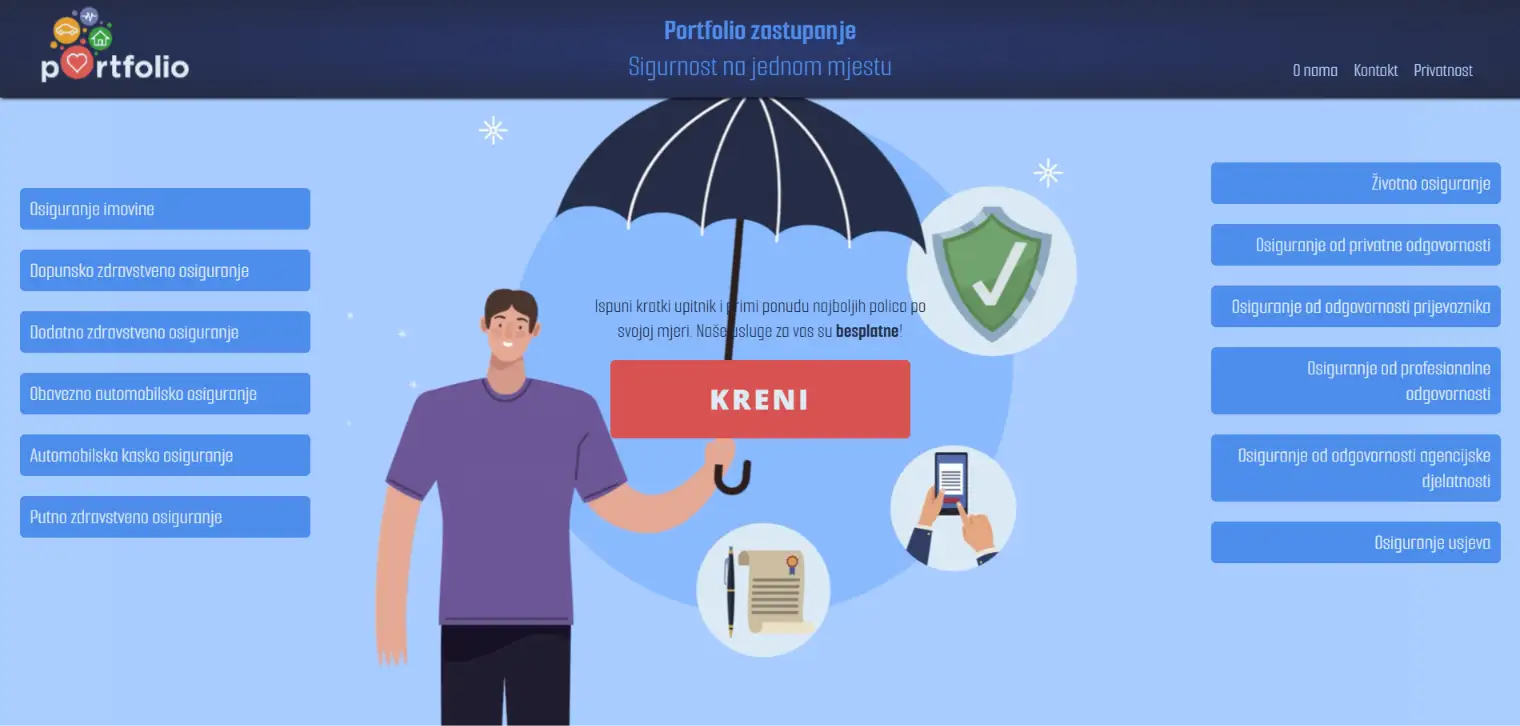
Portfolio - Insurance Representation
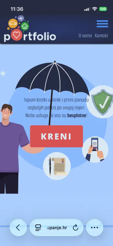
Portfolio is an insurance agency in Požega working with nine insurers, and its service is free to the client — the commission comes from the insurer. That single fact is the whole pitch, so the site says it in the first sentence a visitor reads, before anything else has a chance to get in the way.
Insurance is a field where people rarely know what they need, so the site does not ask them to. A short questionnaire replaces the usual contact form: the visitor answers a few plain questions and the agency comes back with matched offers. What arrives on the other end is not "someone would like more information", but a lead with enough detail to actually quote.
Alongside that, each of the twelve policy types has its own page and its own address — property, supplementary health, motor liability, casco, travel, life, professional and carrier liability, crop insurance. People search for the specific cover they have in mind, not for an agency, and a page per policy is what puts this one in front of them.
Go to website:
portfolio-zastupanje.hrBild.ba
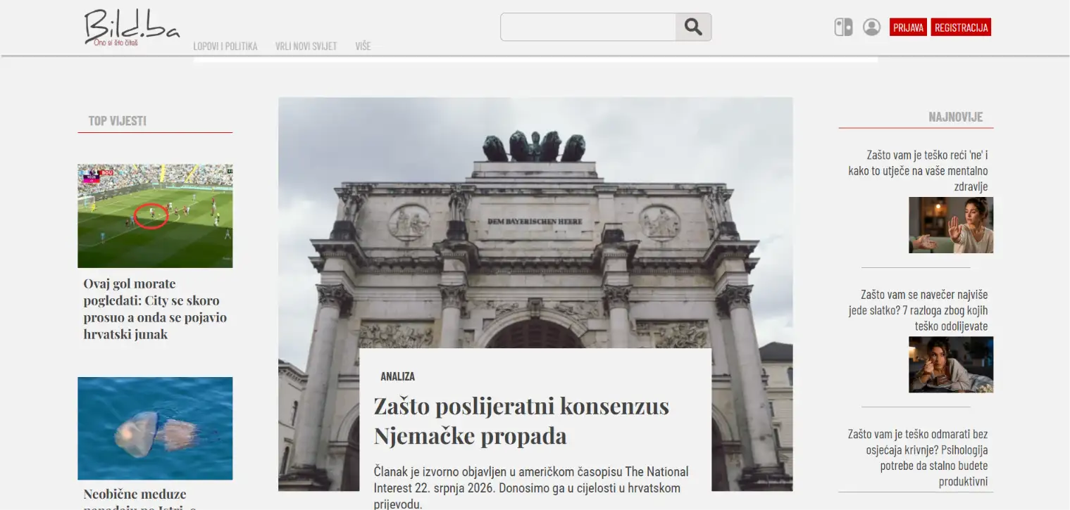
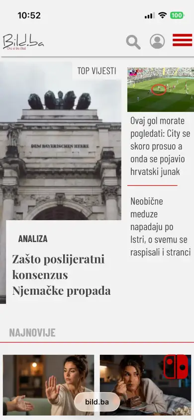
Bild.ba is a news portal from Bosnia and Herzegovina, and the brief was to build one that does not look like every other news portal. The section names set the tone before the design does — Thieves and Politics, Brave New World, Our Stories — and the layout was written to match that voice rather than to fill a standard three-column grid.
Each section has its own arrangement: a lead story with a kicker, a byline and a timestamp, then a mix of card sizes that shifts from one section to the next, so a reader scrolling the front page never sees the same block twice. Every article carries two separate images, one framed for desktop and one for phones, because a crop that works in a wide lead does not work in a narrow column.
Readers choose the look themselves — light, dark or blue, three complete themes rather than an inverted palette. Add tag pages for the stories people follow, member accounts, and an editorial back end fast enough to publish from a phone, and the portal ends up being what a newsroom actually needs: quick to run, and recognisably its own.
Go to website:
bild.baE-Democracy
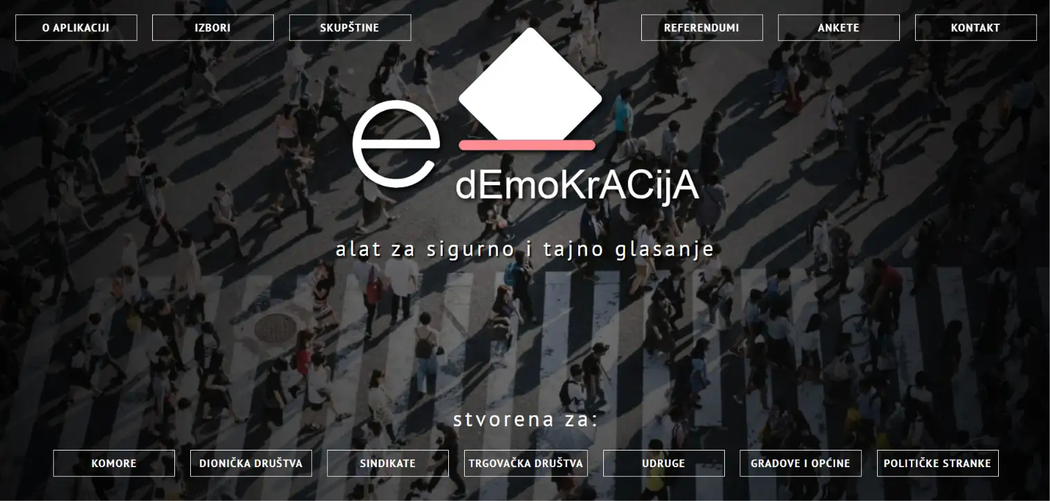
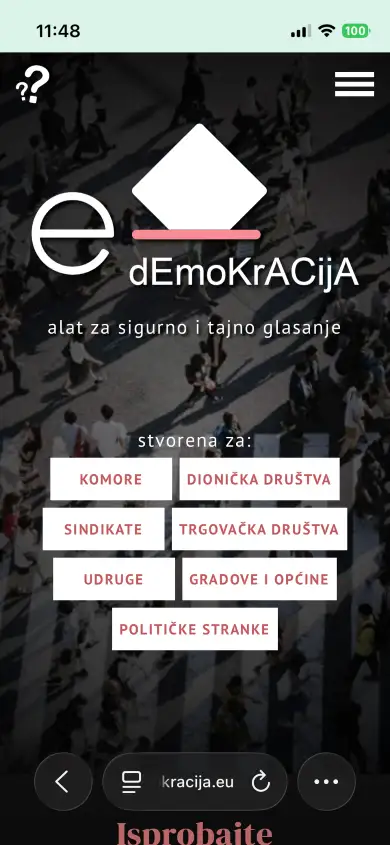
E-Democracy is our own product: a platform for secret, verifiable electronic voting, used by chambers, unions, associations, political parties, joint-stock companies and municipalities. Four modules cover what these organisations actually do — elections, assemblies, referendums and surveys — and each can be configured to the organisation's own statute, down to how abstentions are counted.
Secrecy and verifiability usually pull against each other, and resolving that is the heart of the system. Once a voter is authenticated and confirmed not to have voted already, every trace of the vote's origin is erased: the ballot is added to its option and no one can reconstruct who cast it — not the administrators, not us. Yet each voter can still check that their own vote was counted where they placed it. Organisations choose one of four two-factor methods, and results come out as charts and tables, exportable to PDF or Excel.
The rest follows from real use rather than a feature list: an electorate that can be split into counties, municipalities or local boards and recombined into constituencies, votes weighted by shareholding for joint-stock companies, and accessibility options for theme, contrast and text size, because a voting system that some members cannot use is not a voting system. The Croatian Psychological Chamber has run national and constituency-level elections, assemblies and surveys on it for years, with over a thousand active users, and several Croatian cities and municipalities use it for advisory referendums and consultations with residents.
Go to website:
e-demokracija.euJani transport and logistics
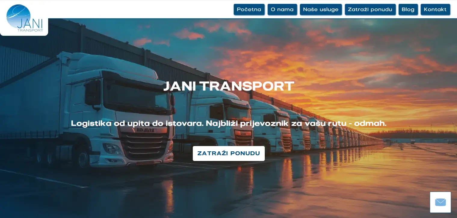
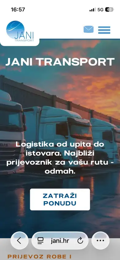
Jani transport organises freight transport across Croatia and the European Union. The company owns no trucks: it finds the nearest available vehicle from a network of vetted carriers, agrees the price and loading date, and handles the shipment and its paperwork through to delivery. The site had to make that clear within seconds, because the first question every visitor arrives with is whether this firm can move their goods on their route. It runs on a custom CMS, so the owners publish news, adjust services and update contact details themselves, without calling anyone. Search and AI optimisation were built in from the start, with structured data and articles answering the questions clients actually ask before they order transport.
Go to website:
jani.hrPano Info
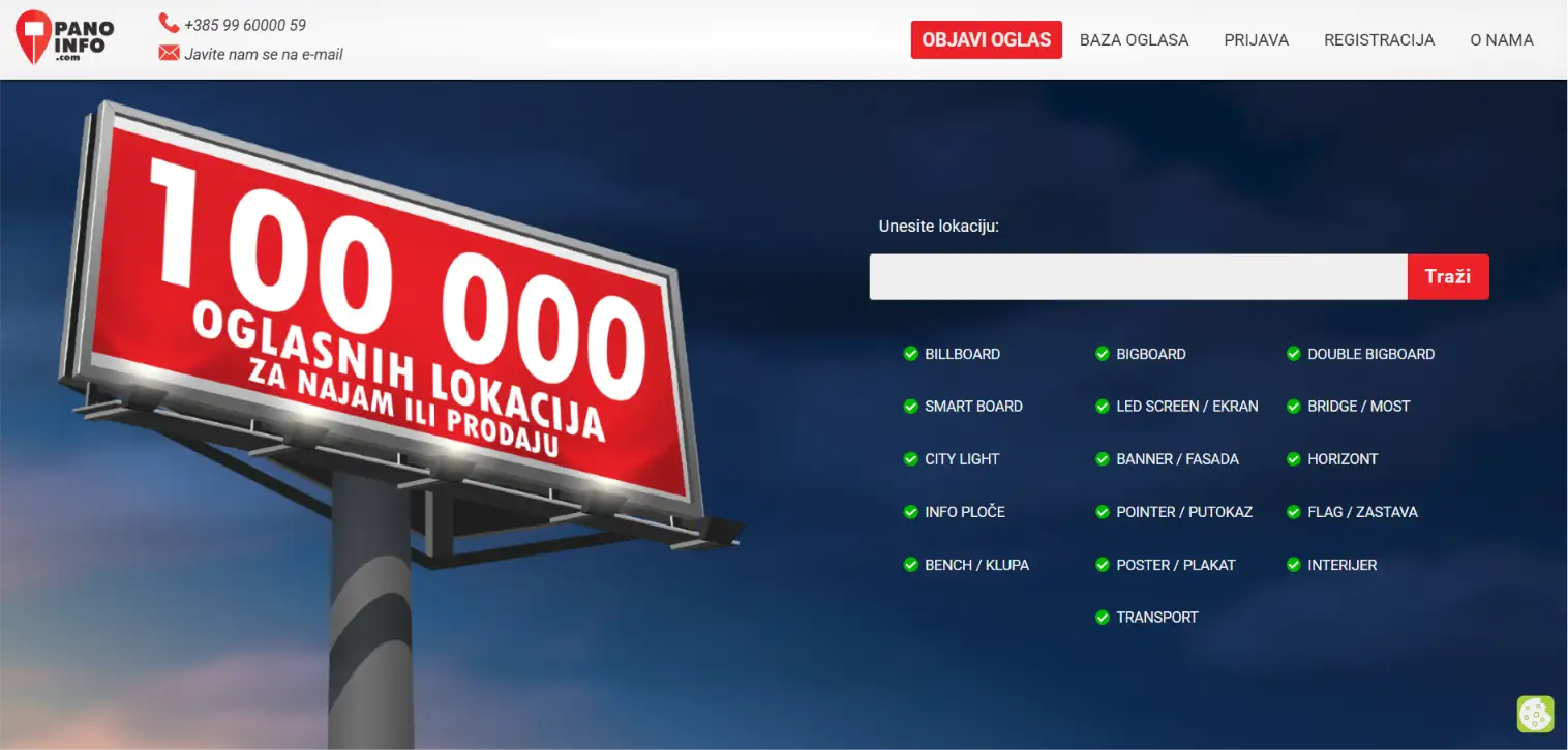
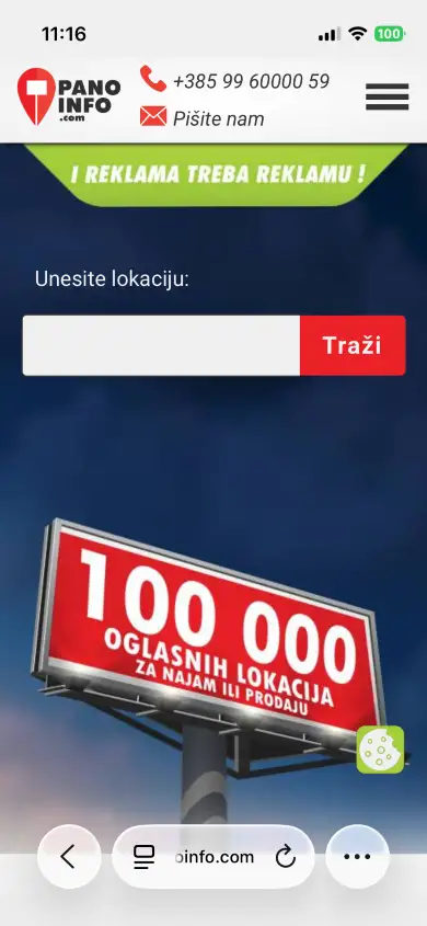
Pano Info is a marketplace for outdoor advertising: billboard owners list the space they have, advertisers find the location and format they need. Two audiences with almost nothing in common, using the same site for opposite reasons — which is the part that makes a marketplace hard to build.
Owners get their own flow: register, publish a listing free, receive enquiries. Advertisers get the other one: filter by location and by any of sixteen media types, from a standard billboard to a LED screen, a bridge panel, a bench or a fully wrapped bus. Every listing has its own page and its own address — dimensions, exact location, availability — so an individual board can be found in search, not just the site.
Underneath sits a reference section explaining each format with its standard dimensions and where it typically works. It was written for advertisers who are not sure what they need, and it earns traffic on its own: people search for what a bigboard measures long before they search for anyone renting one.
Go to website:
panoinfo.comOfficial website of the Municipality of Podgora
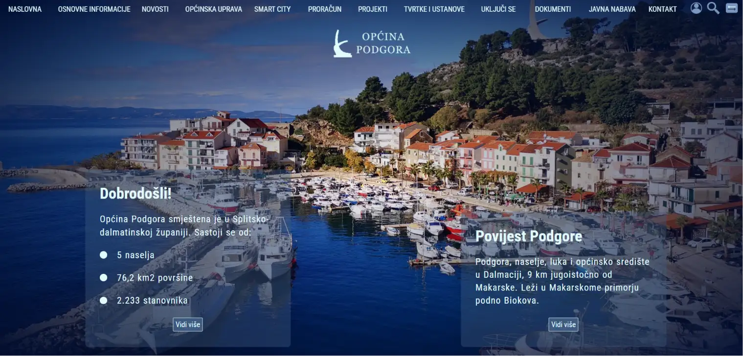
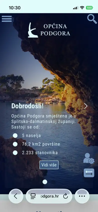
Podgora is a municipality on the Makarska Riviera whose population increases several times during the summer, so its official portal serves two audiences at once: locals who need documents, notices and decisions, and guests who are interested in what is closed, where works are being carried out and where to park.
The site has replaced the outdated installation of a ready-made platform. Everything now stands on a structure written for this municipality — notices and announcements of works published on the day they matter, tenders, budget documents, council decisions, and an administration page that exudes freshness and life like the town itself.
The approach is the same as with other portals here: nothing borrowed from a template, and everything required by law is actually accessible in a click or two, and administrators have a fast and simple OG CMS system with which they can easily update content.
Go to website:
podgora.hrVilla Santila
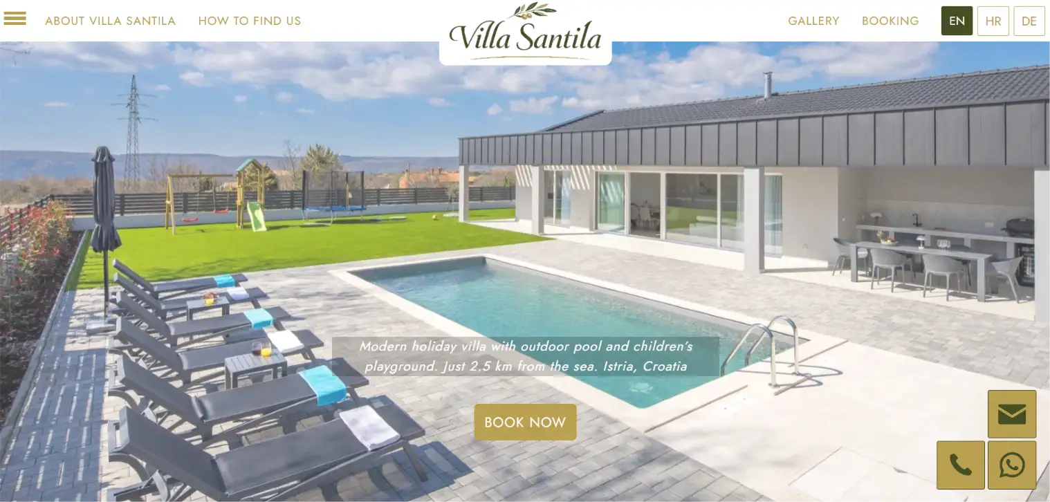
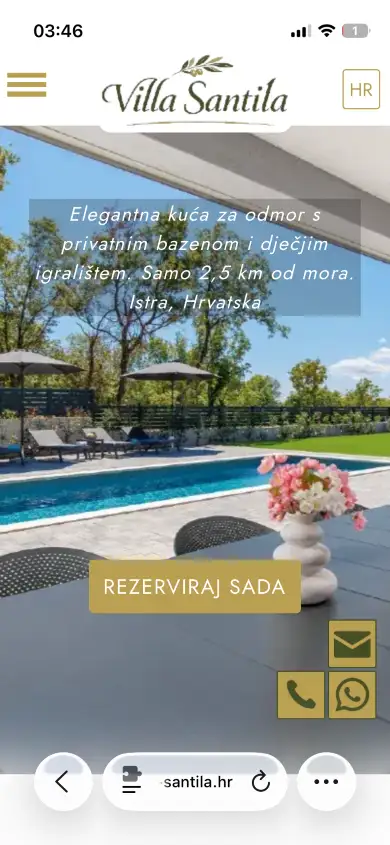
Villa Santila is a 155 m² holiday house above Labin in eastern Istria — private pool, three bedrooms, a fenced yard with a playground, pets welcome, and the sea 2.5 km down the road. A family house, and the site had to read like one.
Istria is one of the most crowded rental markets in Croatia, so this site is built to win on answers rather than adjectives. Which beaches are closest and how long is the drive. How far to Pula airport, to a supermarket, to a decent konoba. Every one of those is a question guests type into a search bar before they book anything, and every one of them has a straight answer here — which is also why the villa turns up in searches that have nothing to do with its name.
From there the path is short: a gallery, a rates page with no fine print, a booking calendar showing exactly which dates are open, and a direct line to the owner by phone, email or WhatsApp. English, Croatian and German throughout, because the guests arrive from all three.
Go to website:
villa-santila.hrTin Matic & Partners Law Firm
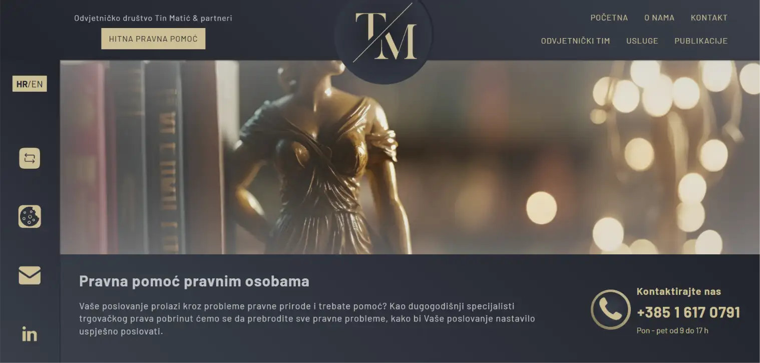
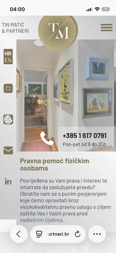
Tin Matić & Partners is a Zagreb law firm working in commercial and international commercial law, arbitration and copyright — one of a small number in Croatia specialised that narrowly. The founder advised the government on Croatia's e-commerce and electronic signature legislation, and the firm publishes in professional journals. The site had to carry that weight without ever saying "we are experienced".
So authority is shown rather than claimed: practice areas named precisely instead of listed generically, lawyer profiles with the actual record behind them, and a publications section that lets the work speak. A visitor with a commercial dispute knows within seconds whether this is the right address — which for a law firm is the only thing the first impression has to do.
The site also ships with a theme switch: four colour combinations, chosen by the visitor. What makes it work is that none of them changes the character. Typography, spacing, structure and tone stay identical; only the palette moves. It is a small feature that quietly demonstrates the larger point — that a design system built properly can flex without losing its identity.
Go to website:
maticipartneri.hrJankovic Apartments Vodice
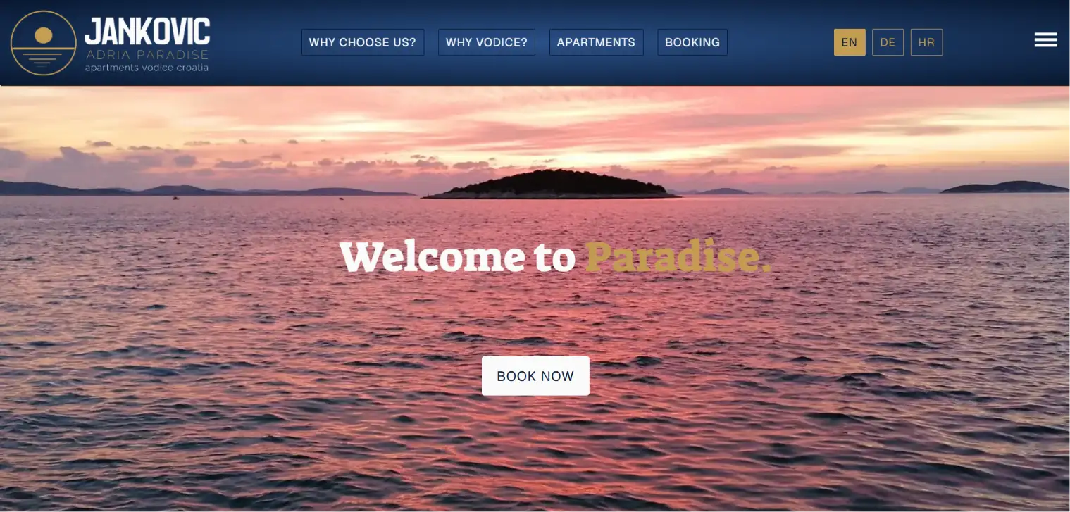
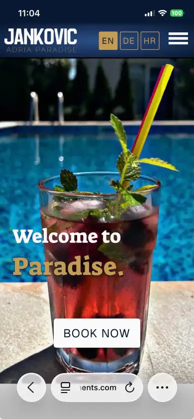
Jankovic Apartments in Vodice started with a handful of units and keeps adding more — Deluxe, Executive, Superior, Studio, Paradise 1, Paradise 2, each a different size, capacity and price. That is the whole problem the site had to solve: it could not be built around a fixed number of apartments.
So it is not a website with an apartment page attached, it is a system. The owner adds a new unit in the admin panel — photos, size, occupancy, features, seasonal and off-season rates — and everything else follows on its own. The unit gets its own page and its own address, appears in the overview grid, joins the dropdown in the booking form, enters the calendar as a separately bookable option, and shows up in the price list. No layout to adjust, no developer to call.
Around that sits everything a guest needs to decide and book in one visit: galleries per unit, availability shown date by date, automatic long-stay and early-bird discounts, a newsletter offer, deposit terms stated plainly and an FAQ that answers what people email about anyway. English, German and Croatian throughout, because the guests come from all three.
Go to website:
jankovic-apartments.comWaste collection calendar
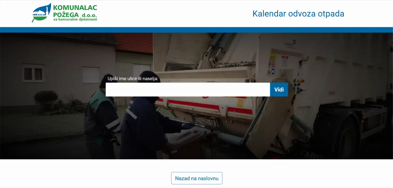
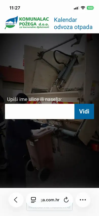
This is a web application that allows citizens to quickly and easily check the waste collection schedule in their street - for each type of waste. It was made by order of the Communal of Požega, but it can also be applied to other cities and municipalities. The system is made so that it can be easily and quickly updated on the other hand in the administration.
Go to website:
komunalac-pozega.com.hrVilla Stella Podgora
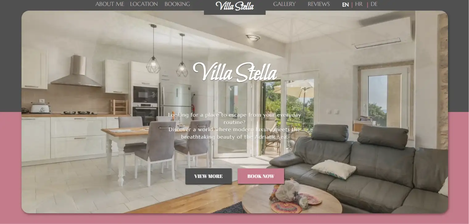
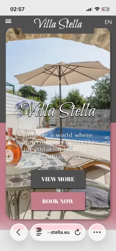
Villa Stella sits in the old part of Podgora, above the Adriatic, with a heated pool and a view that most of the guest reviews end up describing before anything else. The site had one job: sell that view honestly, and then get out of the way.
The booking calendar is the heart of it. Availability, nightly rates and seasonal discounts all come from the owner's own admin panel — she opens dates, sets prices and runs a discount for a specific week without asking anyone. Guests pick an arrival date and book directly, in English, Croatian or German, with the whole site switching language along with them.
The rest is built to turn a visitor into a booking without a detour: a gallery that shows the house as it is, guest reviews left in the guests' own languages, a newsletter that trades a small discount for an email address, and a chat button that reaches the owner on WhatsApp or Viber in one tap. The listing portals are still there, but they are no longer the only way in.
Go to website:
villa-stella.euStart Care Shop
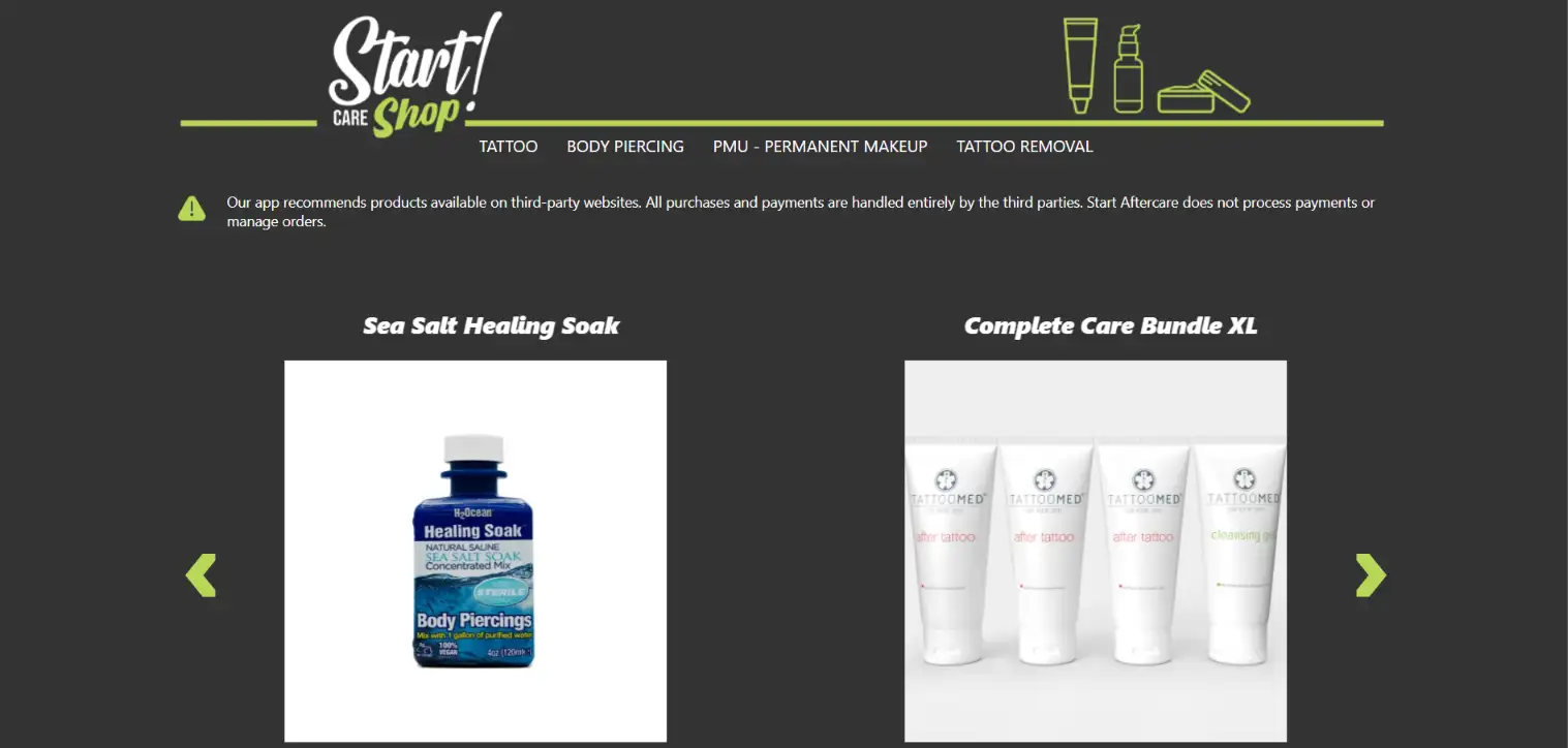
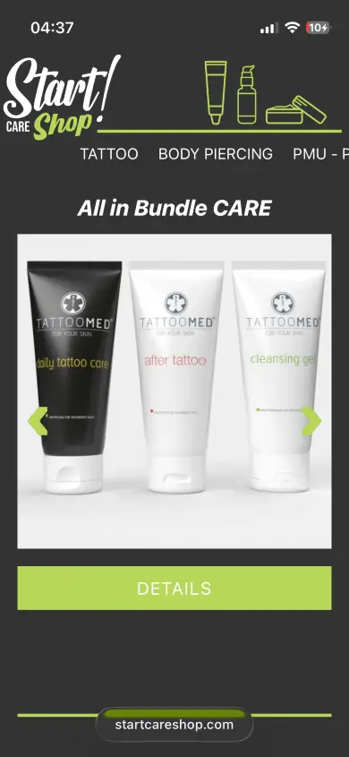
Start Care Shop is a web store connected to the Start Aftercare mobile application. These are products used for care after tattoos or piercings. The app is aimed at a global audience, and so is its store, which actually serves as an intermediary between merchants and app users.
Go to website:
startcareshop.comHvaroma - herbal cosmetics from the island of Hvar
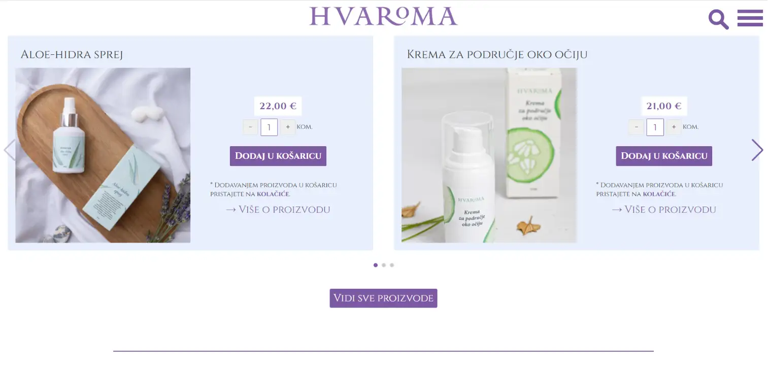
Hvaroma makes botanical cosmetics on the island of Hvar — a brand started by the Jerković family, now holding an Elle Beauty Award (2025), a Grazia Beauty Award (2024) and a readers' award from Ženski recenziRaj, along with a loyal following that keeps coming back. I have worked with them from the beginning, and watching the brand grow into what it is today is the part I am proudest of.
The challenge was to let the products carry the page: full visual presence, no effects, nothing moving for the sake of moving. Behind that, the client runs the shop entirely on their own — adding products, setting prices and editing content through an admin panel that needed no training and no manual.
Customers get a short path from browsing to buying without ever leaving the site, and the blog keeps bringing new readers in through search. That is where the sales base comes from, and with it the room to keep growing.

Go to website:
hvaroma.comOfficial website of the Municipality of Kali
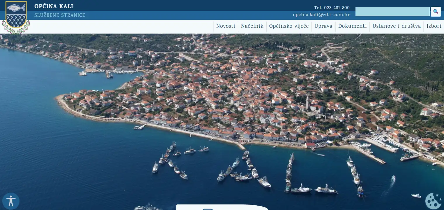
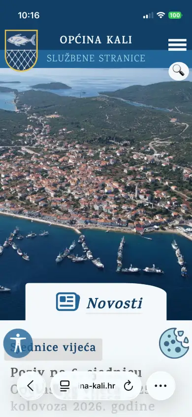
Kali is a fishing municipality on the island of Ugljan, and its official portal is the exception to a rule that holds almost everywhere in Croatia: local government sites tend to be the same aging template, three clicks deep and years out of date.
This one is written from scratch around what residents actually come looking for — the budget, procurement notices, spatial plans, council sessions, public consultations, the official gazette. Everything is a click or two from the front page, published as it happens, and the site is genuinely maintained: the news archive runs to dozens of pages and the newest item is usually days old.
It also works as a hub rather than a dead end. Residents report a broken street light through Popravi.to, look up every payment from the municipal budget in a searchable public register, and take part in advisory e-referendums and rate the administration through a dedicated e-democracy platform. There is an accessibility statement, as the law requires — and, unusually, a site behind it that actually meets it.
Go to website:
opcina-kali.hrGlota - school of foreign languages
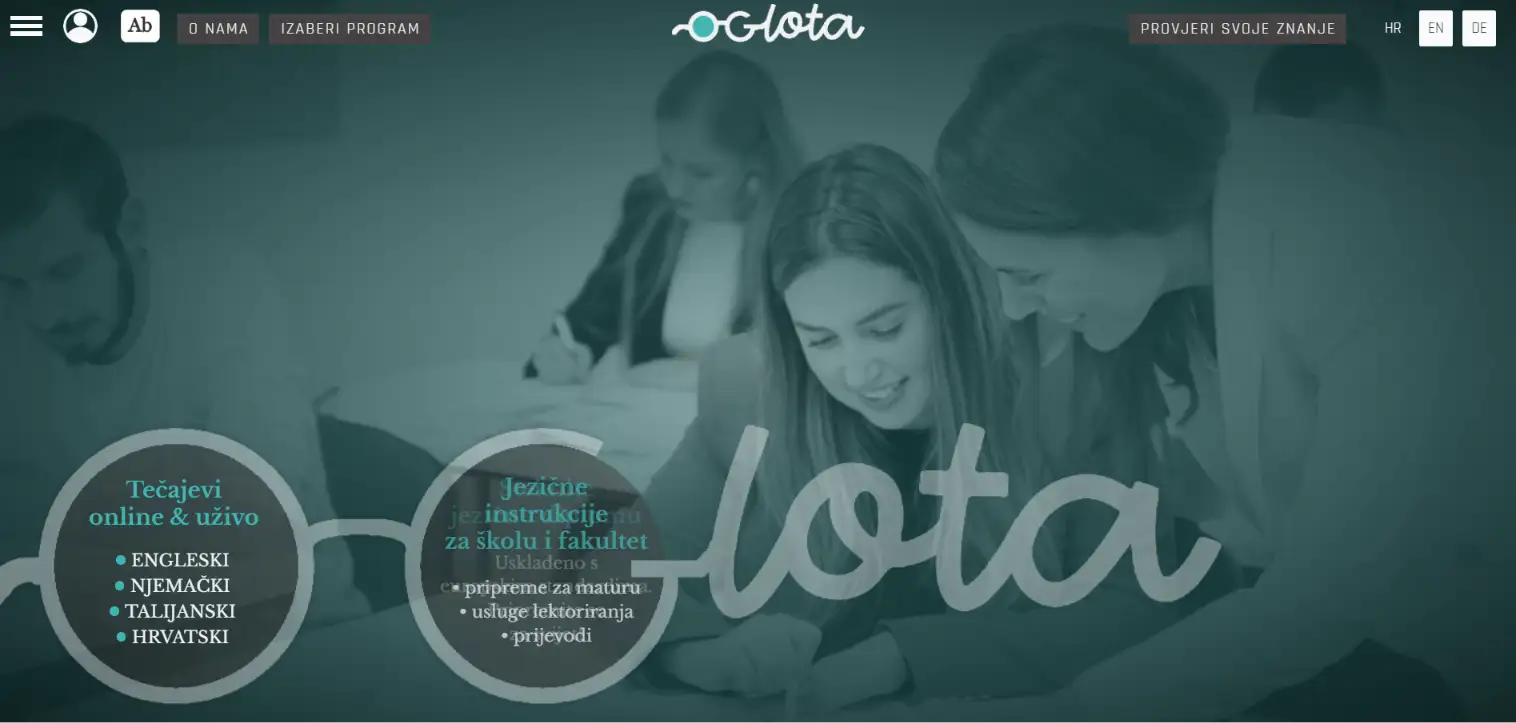
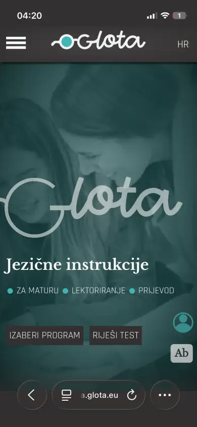
Glota is a language school in Osijek teaching English, German, Italian and Croatian — courses online and in person, tutoring, exam preparation, translation and proofreading. What it needed was not a brochure with a contact form, but a platform that could actually carry the teaching.
So the site is two things at once. On the outside it presents the programmes and lets a visitor pick the right one. Behind the login it becomes a working tool: learners get accounts, sit standardised tests, and the system places them immediately — separately for grammar, spelling and vocabulary, so the result says where the gap is rather than just handing out a level. That means the school can take on students anywhere, without the first lesson being spent working out what they already know.
Everything runs in Croatian, English and German, and the owner fills the task bank herself — no developer needed to add an exercise, change a test or open a new course. The site is currently in its working version while that bank is being built up ahead of launch.
Coming soon
One Gear Blog
Notes from the work, not text written to fill space.
Everything here comes out of actual projects: numbers that surprised me, mistakes that cost something, and decisions that turned out to matter later. If a text cannot help you decide something, it does not get written.
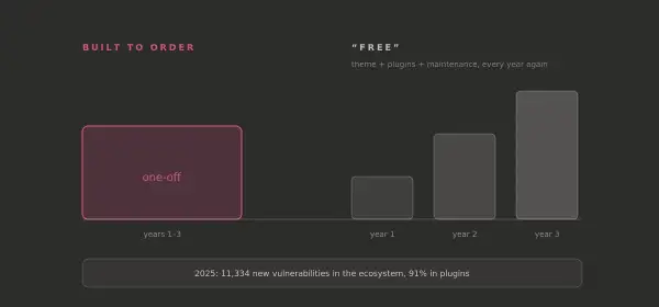
There is no free website. There is only the one you pay for later
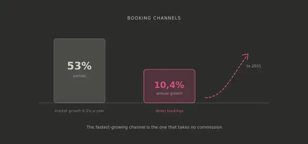
The market moved from "add more beds" to "fill the ones you have"
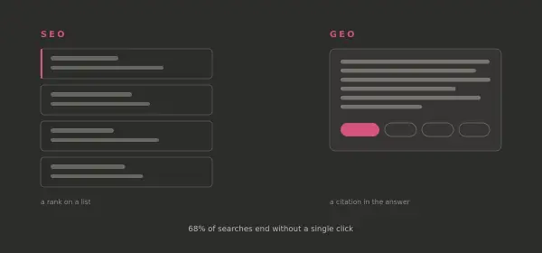
Ten years ago, a search meant a list. Today it means an answer.
Questions that come up
Before you ask
There is no price list, because there is no standard website. Cost follows scope: how many pages and languages, whether there is a shop, a booking engine or an application behind it, and how much of it you want to manage yourself. Tell me what the site has to do and you get a fixed quote, not an hourly estimate that grows along the way.
A business site with a custom CMS usually takes two to three weeks from the first conversation to launch. A webshop or booking system takes a bit longer, an application longer still. The largest variable is rarely the code — it is how quickly the content, photographs and texts arrive.
Yes, and that is the point. Every site comes with an admin panel built for that specific site, so you change text, images, prices and pages without calling anyone. There is no training course and no manual, because if it needs one, it was designed badly.
Yes. Projects run in English, German or Croatian, and most of the sites built here are multilingual anyway. Everything happens remotely, which changes nothing about the work — the only difference is the time zone of the calls.
The site keeps working, and you are not left alone with it. There are no licence renewals and no plugin subscriptions to keep paying, so ongoing cost is usually just hosting and a domain. When something needs changing or extending later, you come back to the person who wrote it.
Clean semantics, structured data and fast pages come as standard, because they are decided while the site is being built. Deeper optimisation — content strategy, GEO, ongoing work on visibility — is a separate service, ordered on its own or agreed as part of the project. How far it goes depends on how much it matters to you.